NYC Manhattan
Community Board 3 Website
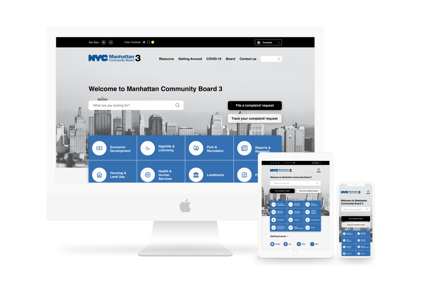
Redesign a website to improve its navigation and bus transit service support with a better user experience across different devices.
↓ View More
Community Board 3 (CB3) of Manhattan is the appointed advisory group of Community Districts 3 (CD3). CB3 strove to build more connections with the residents through the official website.
In this project, our team focused on improving the experience of navigating on the homepage and providing bus information that fits the residents’ expectations towards the bus services to connect with its residents better.
Team
Shan, Yuxin, Steven
My Role
User Research
Hi-fi Wireframes
Wireframes Evaluation
User Interfaces
Tools
Figma
Optimal Workshop
Client
Community Board 3
Duration
Sept.- Dec. 2021
What is Manhattan Community Board 3 (CB3)?
Introduction
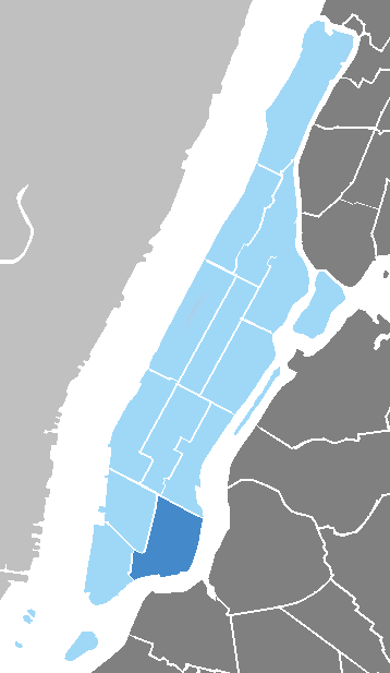
Community Board 3 (CB3) of Manhattan is the appointed advisory group of Community Districts 3 (CD3). It has an important advisory role in dealing with land use and zoning matters, the City budget, municipal service delivery, and many other matters relating to their communities' welfare.
The range of CD3 includes the East Village, the Lower East Side, and part of Chinatown in Manhattan (the dark blue). It is filled with a diverse population with various cultures, religions, incomes, and languages.
Low connection with the residents
The Challenge
The original official website of Community Board 3 has not been redesigned since 2013 (until November 2021).
There were some challenges that CB3 discovered from their report:
Not knowing whether the website delivers the right bus services information
Low accessibility across devices
Wordy and cluttered content is difficult to understand
The original website
(retrieved in Sept. 2021)
The Solution
Key features
Bus Services Page
The project redefines the users' needs for bus services to optimize the CB3 site for searching by four important features:
1. Notify users about bus service changes
2. Real-time Bus Information
3. General guides introducing bus service
4. Highlight accessible bus services
Building Engagement
The homepage has features to file complaints and feedback. Our team also placed the contact information on the footer and navigation bar to assist users to connect with CB3.
Accessible experience
To better embrace diverse residents in CD3, there are some features that will improve accessibility on the website: Adjusting text size, color contrast, and supporting multiple languages.
Design for multiple devices
During the field observation, we found that most people were using their mobile while waiting for buses. Responsive Web Design (RWD) is an essential feature to help users view across different screen sizes.
Secondary research + Business goals
Background understanding
We utilized the Community District 3 Needs Statement Report to prioritize our areas of focus and establish context around the current state of affairs in the board. There are some findings:
The highly dense and diverse population
Addressing COVID-19 and its impacts on the community is a top priority for the board
87.4% of residents do not use a car to commute to work
CB3 stated that their 3 main business goals are:
Better support for the residents as a result of COVID
Redesign the site navigation and make the site responsive
Improve on how residents access bus transit information
User research: Field Observation & Contextual Inquiry & User Interview
Findings
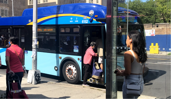
To better understand how the residents use buses and what potential problems they may face, we took the bus to observe people's behavior in the area. There were 3 findings:
1. People are using mobile phones while waiting for buses.
2. The majority of people were over the age of 50.
3. Most users' first languages are not English. (Non-native)
5 key insights
After interviewing 6 residents with questions about the CB3 website and bus experience, our team compiled the findings by affinity mapping and finally discovered 5 key insights.
1
Aesthetics and Navigation Concerns Impact Usability
2
Real-Time Information is a priority
3
Feedback Mechanisms Build Trust
4
Transportation Accessibility Needs to be Highlighted
5
Opportunity to Facilitate Bus Adoption
"How might we deliver the right information with a better CB3 website experience?"
Competitive analysis
Gain inspiration
By referring to 9 separate government official websites and bus transit service websites for inspiration, we found that most of the websites use easy-to-understand language for different user groups, build long-term trust through a feedback section, and have quick access to updated COVID-19 news.
Understand who the users are
Put ourselves into users’ shoes
We found that there are 2 clear types of users: People with "Low Bus Awareness" and people with "High Accessibility Needs."
By conducting the user mindset method, we could clearly differentiate their needs.
We utilized the user journey map for the two types of users to discover design opportunities from the process of taking buses. The possible opportunity would be:
Introducing bus services or guides for users with “Low Bus Awareness”
Knowing how to get assistance with bus-accessible service for users with “High Accessibility Needs”
Design
Reconstruct the website navigation
During the interviews, the users stated that the current website is cluttered and difficult to navigate. To help users easily navigate the website, we recruited some people to do card sorting and tree testing.
The 7 participants categorized the 42 cards into 6 groups. Based on that, we proposed the 1st version of information architecture for the other 8 participants doing tree testing. By utilizing their feedback, we revised and finalized the sitemap with 6 main categories: Web settings, Contact Us, Resources, COVID-19, Getting around, and Board.
Design and Test
Wireframing
To evaluate the features our team chose to get early feedback on our concept, we recruited 6 participants and gave them 2 tasks. Based on their feedback, we iterated and generated the new hi-fi wireframes.
This is the user flow about finding accessible bus transit service information. We developed three pages: Homepage, Getting Around, and Bus.
Design
Responsive Layout
During the phase of field observation, we found that most residents were using their mobile when waiting for buses. However, the website is not responsive on mobile. It is essential to develop the CB3 website to communicate with a variety of screen sizes. We made three breakpoints:
1440px width (Desktop)
768px width (Tablet)
320px width (Mobile)
Design
UI Kits
Due to the fact that we were redesigning an existing website, it’s crucial that the color, font, and style stay consistent throughout the current website.
Design
Hi-Fi Screens
We applied the design system and four design principles (Inclusive, Simplistic, Engaging, and Balanced) to generate a high-fidelity user interface and keep the CB3 website style consistent on the homepage as well as the pages concerning, getting around and bus services.
Reflection
What I learned
User Interview
Interviewing users without bias is an important skill to develop that needs more practice.
Testing and feedback matters
We iterated the features several times from testing. Putting ourselves into users' shoes helped us get away from blind spots and redirected us into the right direction.
You may also like
-
![]()
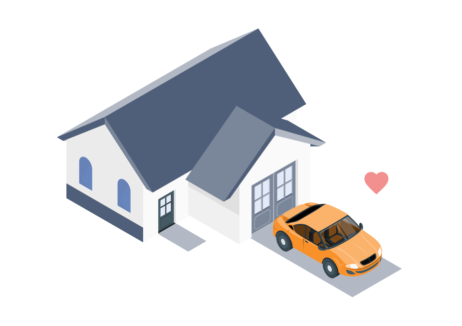
🔒 Nearby Parking
A two-sided marketplace that connects people who want to rent out their idle parking spots with people who are looking for places to park
-
![]()
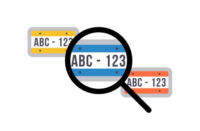
🔒 Parking Management
A parking management application that assists management in simplifying the license plate verification process.
-
![]()
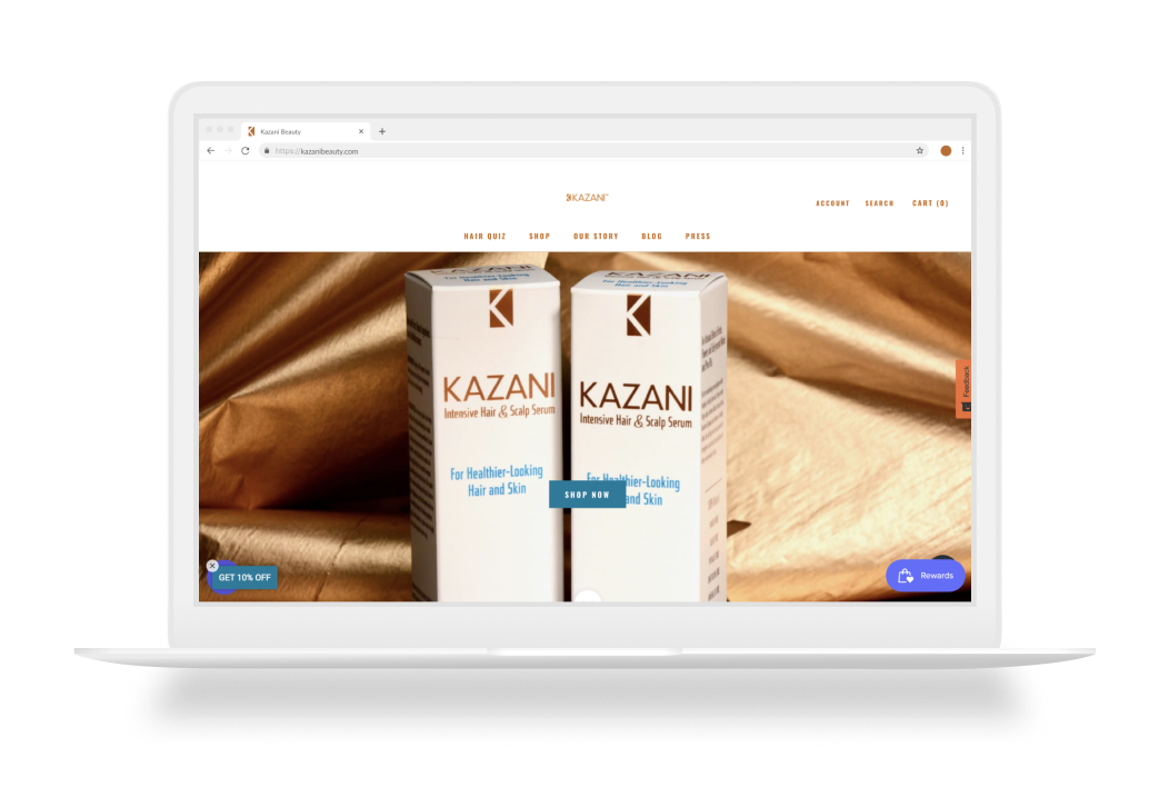
Kazani Beauty
Evaluate and improve the usability issues on a hair beauty website to make users stay on the website and purchase.
-
![]()
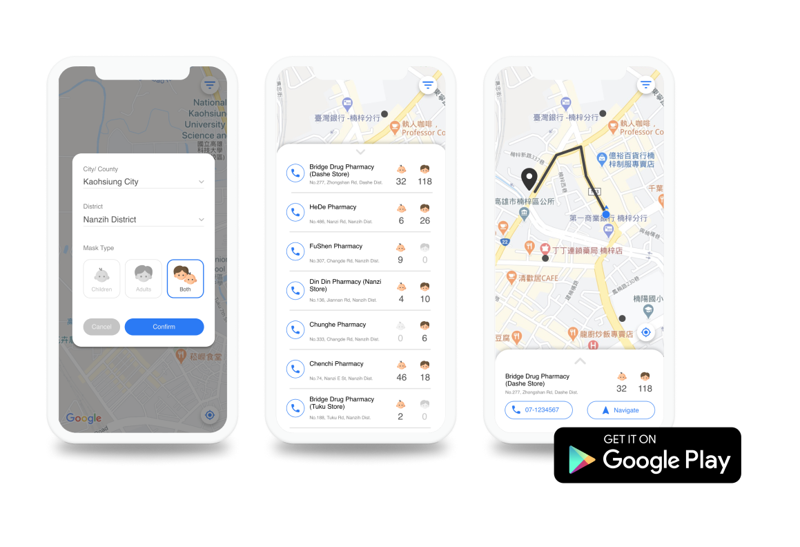
Instant Mask Map
A mobile app that empowers Taiwanese people to improve their efficiency in searching for masks.