Kazani Beauty
Evaluate usability issues on a hair care website through usability testing and then make recommendations to improve it into a more user-friendly website.
↓ View More
Overview
Kazani Beauty is an eco-friendly hair and body care brand that prioritizes natural ingredients and sustainability.
As UX consultants, our team evaluated the usability of their e-commerce website and delivered 6 recommendations to enhance user-friendliness, navigation, purchase flow, and trust.
My Role
-Planning and organizing studies and testing
-Moderating and facilitating usability testing sessions
-Analyzing the results of testing
-Creating mockups for design solutions
Tools
Zoom
SUS
Google Suite
Rainbow Sheet
Figma
Duration
Oct.- Dec. 2021
Team
UX designer (Me)
2 UX consultants at Pratt’s DX Center
The Challenge
The 3 goals
The CEO of Kazani, Selmin Karatas, wanted to focus on improving the online user experience of the website.
There are 3 goals Karatas cares about the most:
1. Efficient navigation on the website
2. Smooth purchase flow to keep user retention
3. Building trust to convert users into customers

Efficient Navigation


Smooth Purchasing Flow
Trustworthy Relationship
How might we help Kazani recognize usability issues and make recommendations to improve the user experience?
Impact In Real World
Before & After
Kazani adopted and implemented our recommendations on its official website.
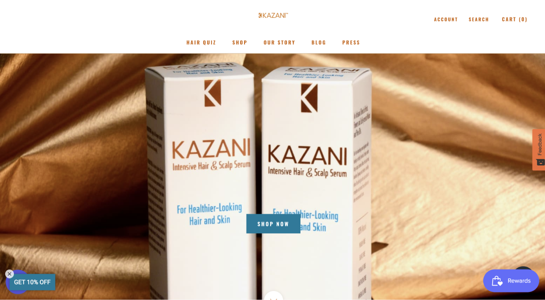
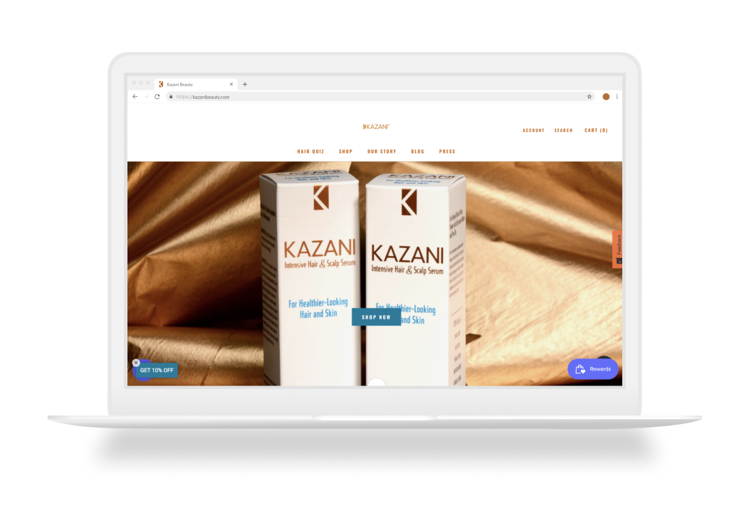
Before
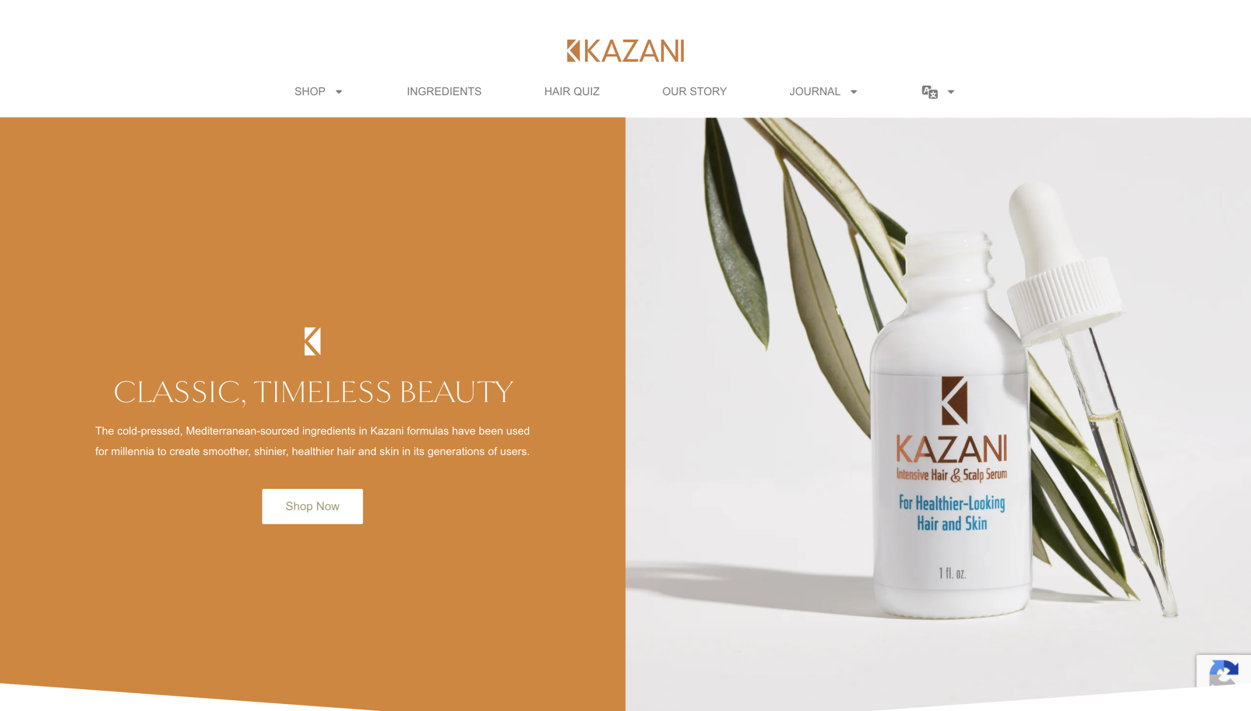
After
Project Process
How we did
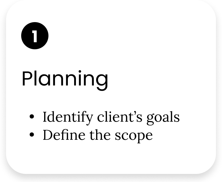
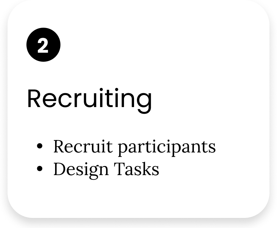
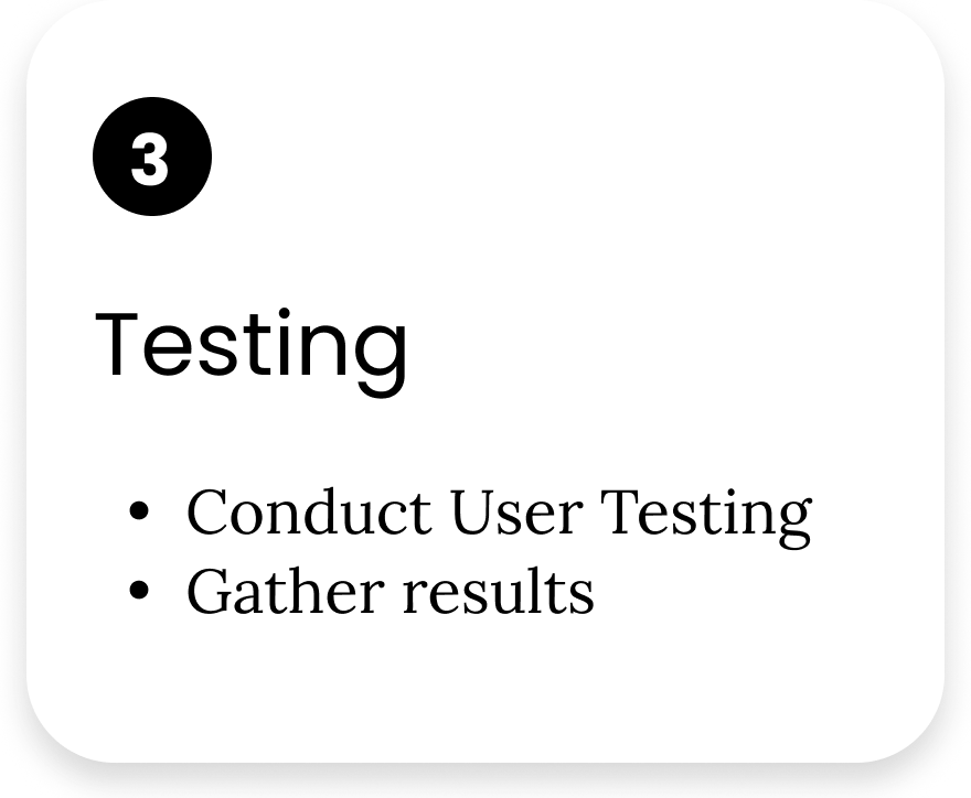
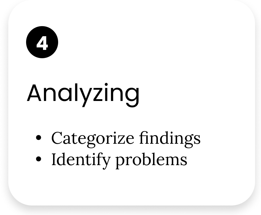
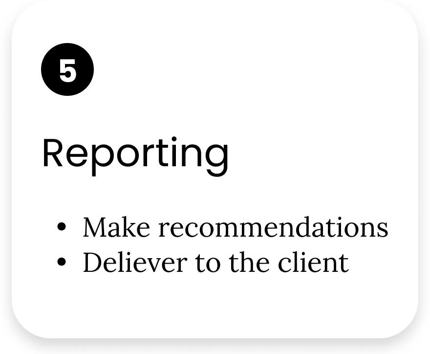
There are five stages to our process: Planning, Recruiting, Testing, Analyzing, and Reporting.
For an online shopping website, the essential thing is to encourage users to purchase products. To find out the potential usability problems while purchasing, we focused on the website's key pages: the homepage, the product list page, and the product detail page.
Evaluation & Testing
Searching for products was a big issue
Our team targeted participants between the ages of 21 and 50 because Karatas wants to expand the market to 20s old besides the existing customer userbase. Finally, 6 participants fitting our qualifications were recruited by our team.
We collected users’ quantitative and qualitative data during and after the task. The data included the time each task took, the success rates, the confidence degree, the difficulty degree, and the participants’ personal feelings and advice.
6 participants: 4 females | 2 males | 21-50 years old
Failed to search for the assigned product
67%
The site was too wordy to navigate
67%
Noticed and disliked the unclickable buttons
67%
Not recommended the site to a friend
50%
Analyzing findings
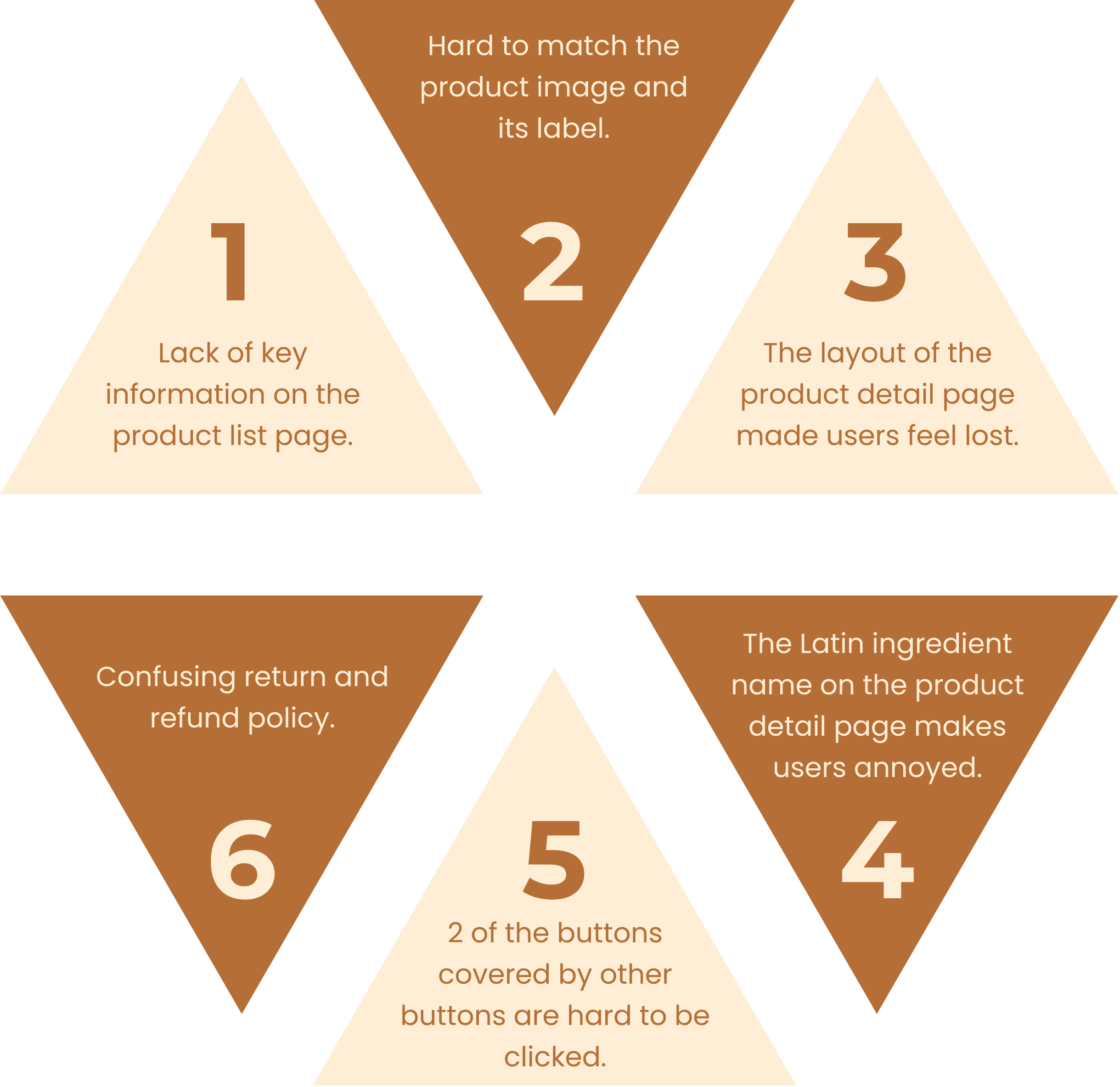
6 key problems
Our team used The Rainbow Sheets to compile 85 findings to be able to narrow it down to 6 key problems in the following steps:
Recording our observations from each of 6 participants while testing
Combining the same problem that the different participants encountered to the same finding
Scoring the priority of each problem (1 means low priority; 5 means high priority)
Grouping similar problems into categories
Recommendations & Mockup
6 recommendations to improve the online shopping experience
Navigation
Recommendations 1 and 2 target resolving ambiguities related to different products that highly affected the confidence of several users while navigating the website.
Purchasing flow
Recommendations 3 and 4 aim to improve the product browsing experience on the product detail page before purchasing products.
Trust-building
Recommendations 5 and 6 are making the website more accessible and reliable. With these simple, cost-efficient recommendations, Kazani may improve its usability on the website.
Recommendation #1
Add a blurb to improve the efficiency of navigating

ORIGIN
4 out of 6 participants failed to find the product we requested.
The product names are too similar to distinguish the differences.
It is challenging to differentiate products with similar images.
The inconsistent height of the product images made participants perceive the site as unreliable.
RECOMMENDATION
Add a blurb to help users understand the key features of the products.
Highlight the differences between similar products.
Maintain consistent formatting.
IMPLEMENT
Implement our recommendations while simultaneously updating the featured products.
Recommendation #2
Match images with the right products

ORIGIN
2 out of 6 participants were confused about which product the image belonged to, which increased cognitive and physical effort, resulting in more time being spent navigating the products.
RECOMMENDATION
Ensure accurate matching of images with the corresponding products.
IMPLEMENT
Adopt the concept of matching images and blurbs with their corresponding products.
Recommendation #3
Adjust the layout into 3 main sections

ORIGIN
2 out of 6 participants found the page to be excessively wordy, making it difficult to navigate. In fact, one of the participants resorted to using "ctrl+F" to search for specific keywords.
RECOMMENDATION
Adjust the layout on the page and group the contents into three main parts: key purchasing functions, minor long-text information, and reviews. Ensure that the key information necessary for customers to make a purchase is placed at the top of the page in order to streamline the purchasing flow.
IMPLEMENT
Adopt the layout of our tab design to display detailed information.
Recommendation #4
Add images and common names for ingredients

ORIGIN
4 out of 6 participants expressed difficulties in navigating and skimming through the ingredients. They found the use of Latin names for ingredients to be unhelpful.
RECOMMENDATION
To enhance navigation and comprehension of the ingredients, we recommend incorporating images and providing both the common names and their effects alongside the Latin names.
IMPLEMENT
Adopt the concept and provide links for additional details on specific terms.
Recommendation #5
Make buttons discoverable and clickable

ORIGIN
All six participants noticed that the chatbot button and accessibility button in the lower corner were covered and hard to tap.
RECOMMENDATION
Based on our recommendation, we suggest removing the "GET 10% OFF" and "Rewards" buttons. Additionally, it would be beneficial to relocate the promotional news to the top of the home page. By implementing this change, not only will all information be easily accessible, but it will also remain visible across all pages.
IMPLEMENT
Remove the buttons with low usage from the page.
Recommendation #6
Use the hierarchy of text for readability

ORIGIN
Even after successfully finding this page, all users still struggled to understand the process of returning and refunding items. This difficulty arose due to the lack of key information that users expected to find in the provided paragraphs.
RECOMMENDATION
Clearly outline the process for users to request returns and refunds.
Format lengthy texts into numbered or bulleted lists for improved readability.
(Note: The content is derived from the return policy on the official Codibook website.)
IMPLEMENT
Adopt our concept to improve readability and shorten each paragraph. Also, name a headline for each related paragraph.
Client feedback
“OMG, how could I leave that out? OK, I'm gonna get this all fixed."
- Selmin Karatas
Reflection
What I learned
Interacting During the Session
During user testing, giving appropriate reactions at the right time towards users without affecting their actions is an important skill to develop that needs more practice.
The gold-standard method
Compared to the Unmoderated Remote Usability Test and Cognitive Walkthrough, User Testing is much more time-consuming, but I can dig deeper into the reasons for their actions in real-time.
Eye-tracking
It was interesting that participants might not remember every step of thinking or found it difficult to describe verbally. Eye-tracking could be a powerful method for evaluators to discover more problems in usability testing. I'd like to learn and involve the tool of eye-tracking in a future evaluation, which would be a big improvement in regards to understanding users through their eyes’ behavior.
You may also like
-
![]()
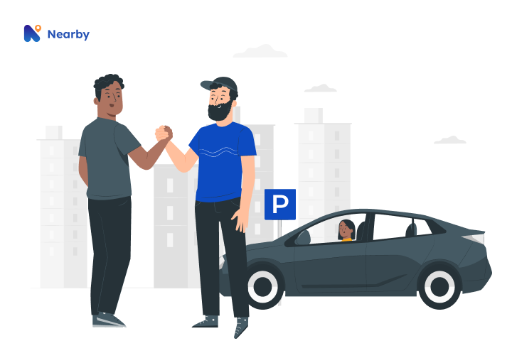
Nearby Parking
A two-sided marketplace that connects people who want to rent out their idle parking spots with people who are looking for places to park.
-
![]()
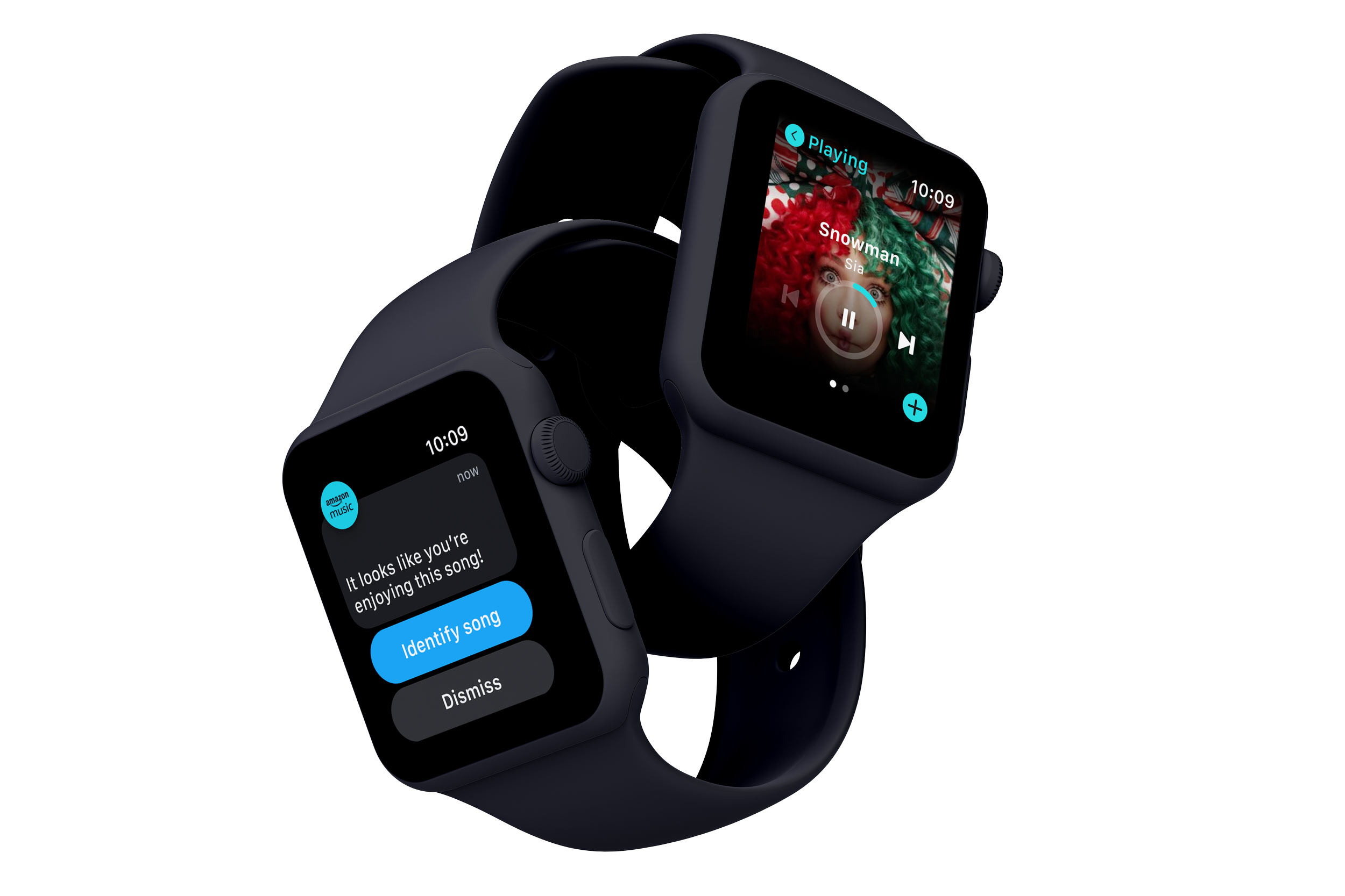
EmoBeat
A wearable solution that utilizes biometric data and emotion to address the problem of song recommendations not matching young adults' preferences.
-
![]()
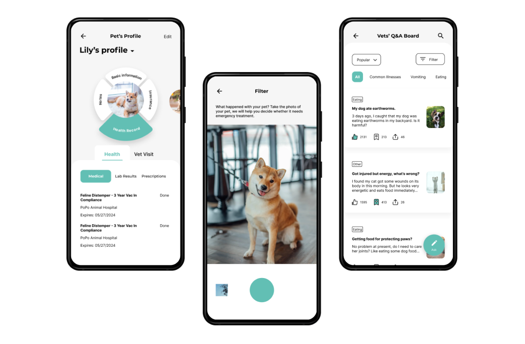
Veticure
A mobile application that enables pet owners to access reliable pet health knowledge easily.
-
![]()
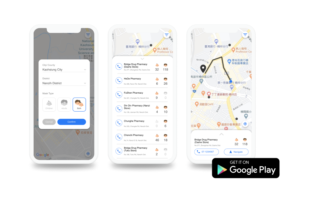
Instant Mask Map
A mobile app that empowers Taiwanese people to improve their efficiency in searching for masks.
-
![]()
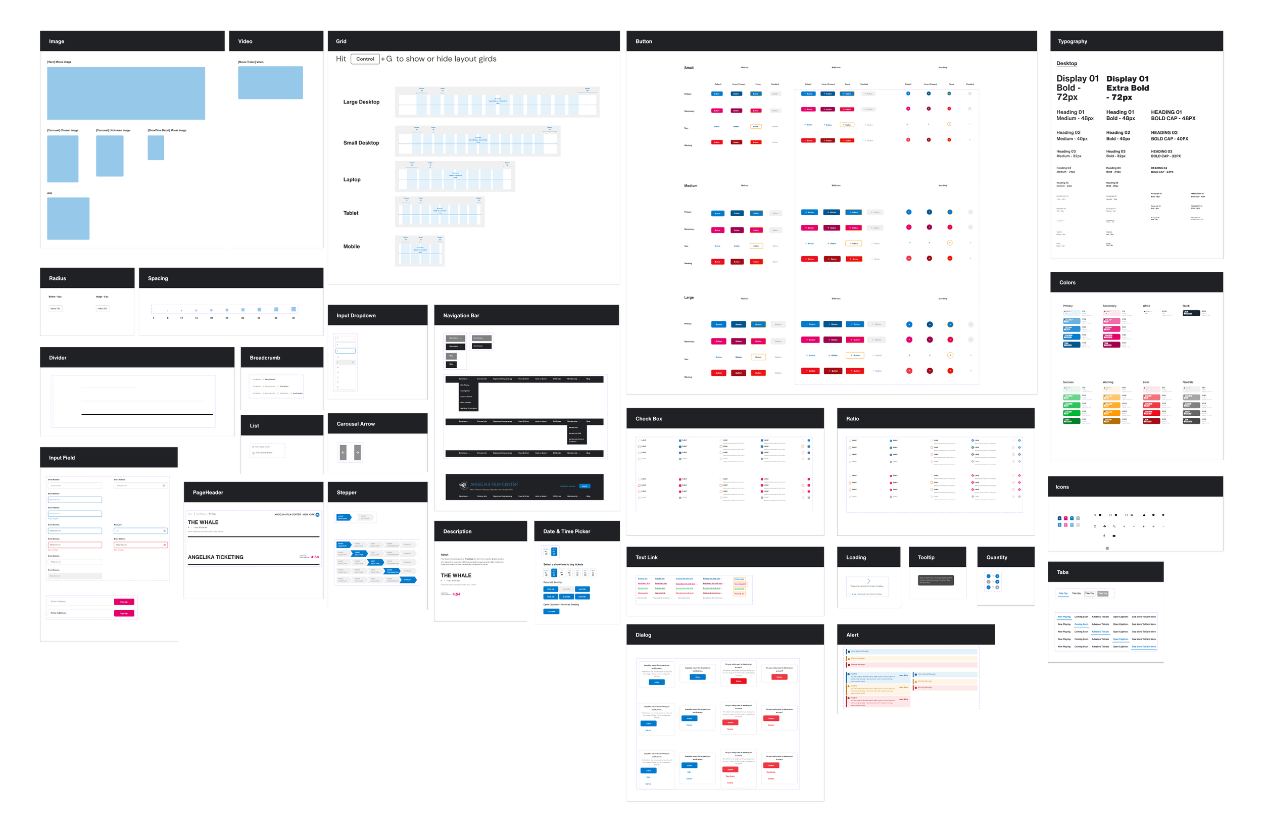
Simula Design System
Crafting an atomic design system to address design inconsistencies and enhance accessibility.