Simula:
Crafting a Design System with Atomic Design Methodology
↓ View More
Summary
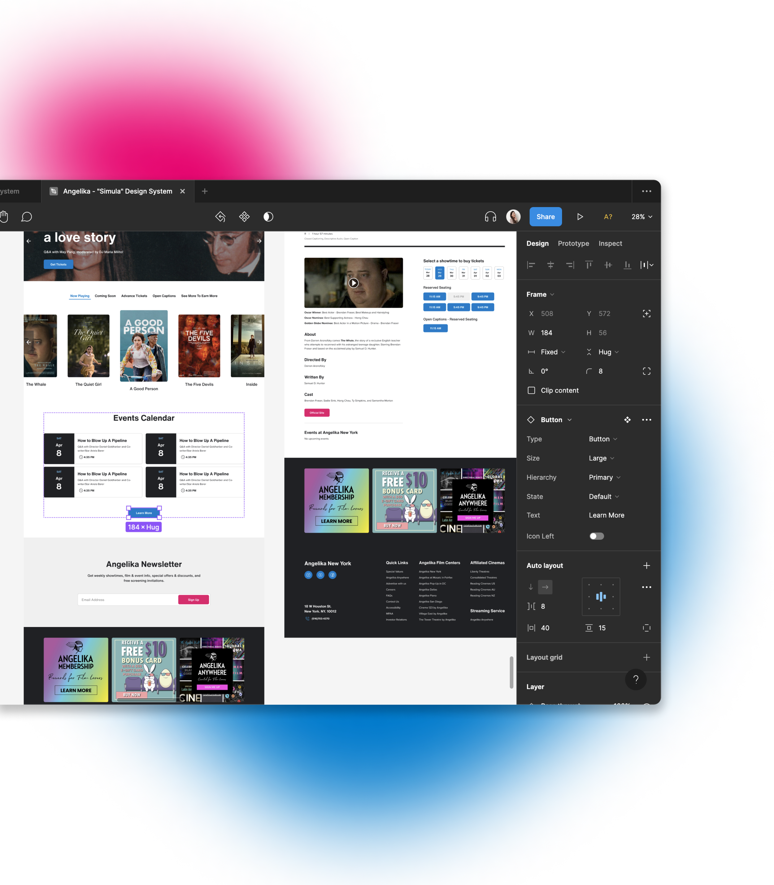
Simula, a design system our team built for the Angelika Film Center NYC website, tackles design inconsistencies and enhances accessibility.
By leveraging Atomic Design methodology, Simula enables a cohesive and inclusive user experience throughout the site.
Figma UI kits (Unofficial)
Documentation site (Unofficial)
Duration
Mar - May 2023 (3 months)
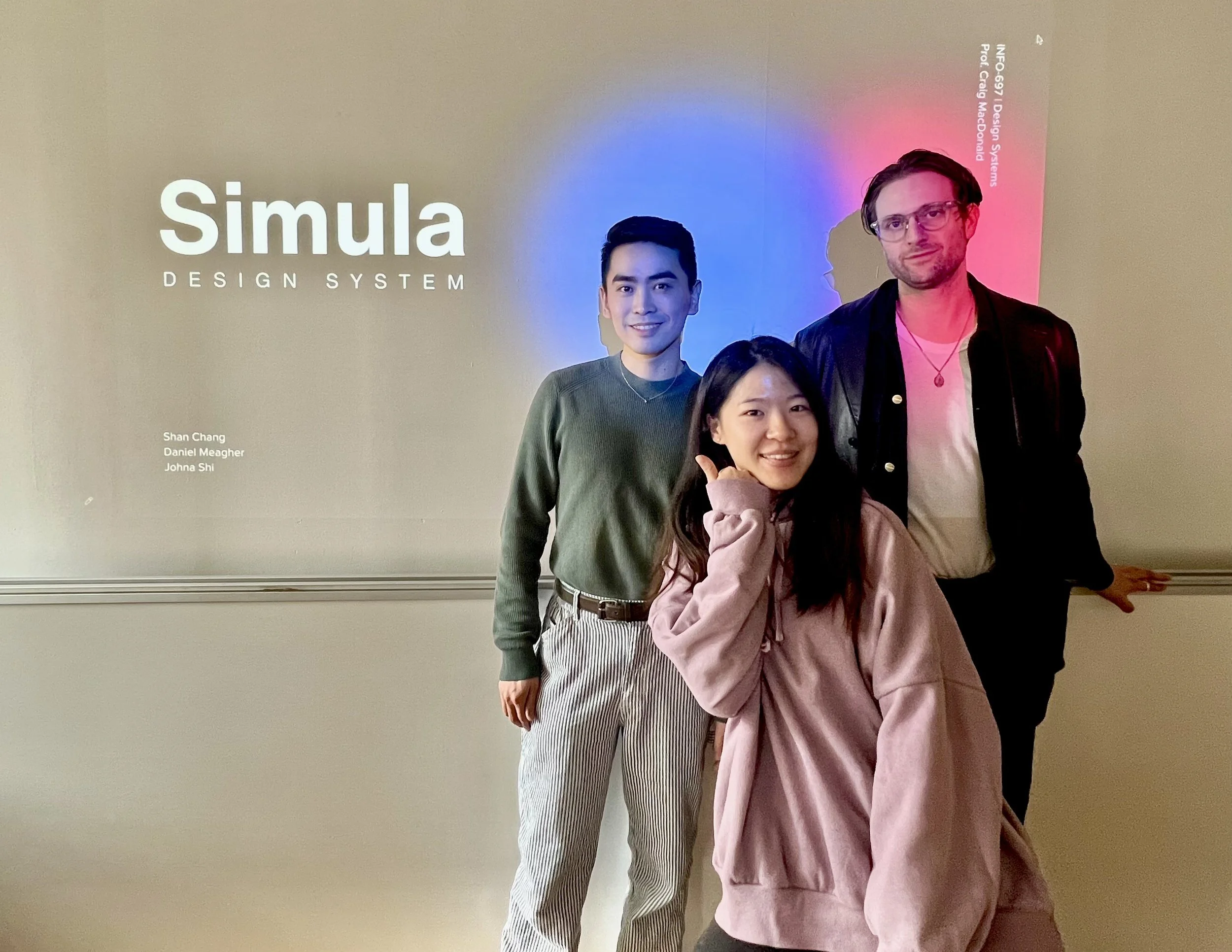
Team
Shan Chang
Daniel Meagher
Johna Shi
Responsibilities
Identifying principles and guidelines with accessibility
Building and publishing the UI kits of the design system on Figma
Branding and documenting the design system on ZeroHeight
The Challenge
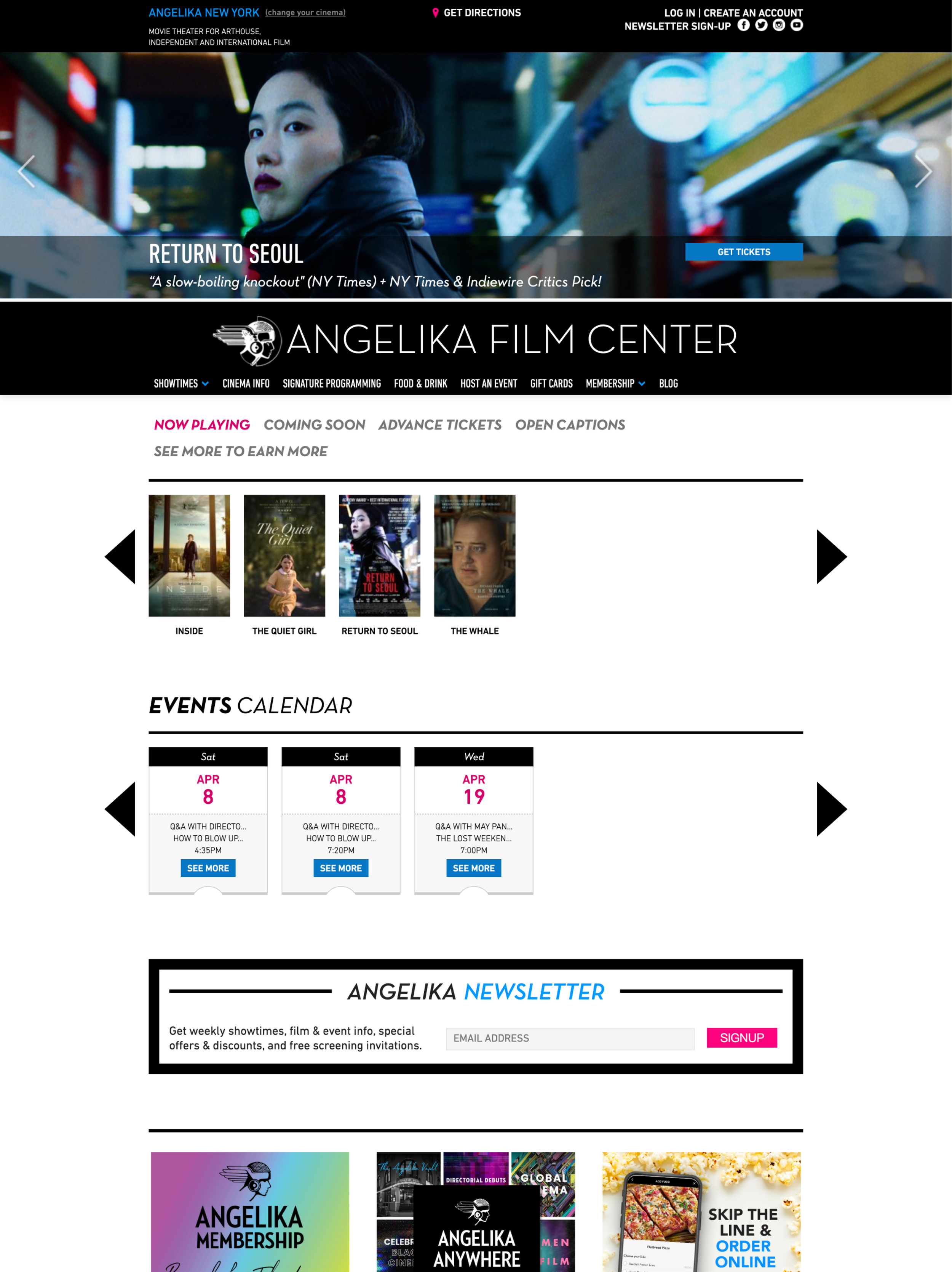
The Angelika Film Center NYC (referred to as AFC), a highly respected cultural institution in New York City, has been at the forefront of showcasing independent and foreign language films for over 3 decades.
However, we found that the existing website suffers from a lack of consistency and coherence, leading to a subpar user experience for visitors.
Principle Extraction
Identifying mission and values
To ensure alignment between the new design system and the current AFC's website, we analyzed their mission and values.
This analysis enabled us to identify keywords and concepts that served as guiding principles throughout the development of the design system.
Problem Discovery
Deconstructing the existing website
To analyze the website's inconsistencies and improve cohesion, we deconstructed the interfaces, categorizing styles and components like buttons, typography, and imagery.
Our findings revealed challenges in visual accessibility, information hierarchy, and design inconsistencies. We identified areas for improvement to optimize performance and enhance the user experience.
Transforming to Our 4 Design Principles
These principles guided our entire design process, ensuring coherence and relevance to the center's vision.
-
Follows WCAG 2.1 Guidelines to meet the latest accessibility requirements
User-friendly and intuitive for all
-
Maintains consistent visual language
Reduce users’ cognitive load and minimize confusion
-
Captures user attention and interest
Encourages users to interact and explore
Immersive and enjoyable user experience
-
Adheres to Atomic Design Methodology
Reusable components for various cases
Easily updatable and adaptable
Atomizing the Design System
We utilized the Atomic Design methodology to build our design system, starting from the smallest building blocks known as atoms and gradually assembling them into complete pages.
This careful and systematic approach allowed us to develop a design system that is both consistent and easily adaptable to future needs.
Figure Credit: Figure from "Atomic Design" by Brad Frost
0. Foundations
Colors and typography
We enhanced the existing website by resolving color and typography inconsistencies, while prioritizing accessibility according to WCAG 2.1 guidelines. By carefully evaluating text and background color contrast, we ensured a comfortable viewing experience for all users.
Headings were styled with Helvetica Now, while Proxima Nova was chosen for paragraphs and other content, ensuring a consistent and visually pleasing website experience that is accessible to all.
0. Foundations
Layout: grid system, spacing, and breakpoints
Our layout system provides a clear framework for efficient website building. With predefined grids, spacing guidelines, and breakpoints, designers can create visually cohesive and responsive designs. This streamlines the process, saves time, and ensures a professional look across devices.
1. Atoms
Creating the Individual Pieces
After defining the foundations, the first step was to design the smallest building blocks of our design system: Atoms. These included buttons, icons, checkboxes, radio boxes, input fields, and more.
Each atom was meticulously crafted to fit together seamlessly, like puzzle pieces with their own unique shapes and colors.
2. Molecules
Forming Clusters of Connected Pieces
In our design system, molecules were born from the fusion of 2 or more atoms. By clustering atoms together, we built more intricate UI components such as steppers, date pickers, breadcrumbs, and more.
3. Organisms
Building Larger Sections
Organisms represent larger sections of the design system. By combining multiple molecules and atoms, we created self-contained sections of the user interface, such as headers, footers, and sidebars.
4. Temples
Unveiling the Structure
Combining organisms together, we created templates that define the overall composition of UI screens or layouts.
5. Pages
Completing the Final Picture
Pages are the culmination of the design system, created by combining templates to form complete web pages. By utilizing pages and showcasing the seamless integration of all design elements, we built a cohesive user experience.
Using the Design System
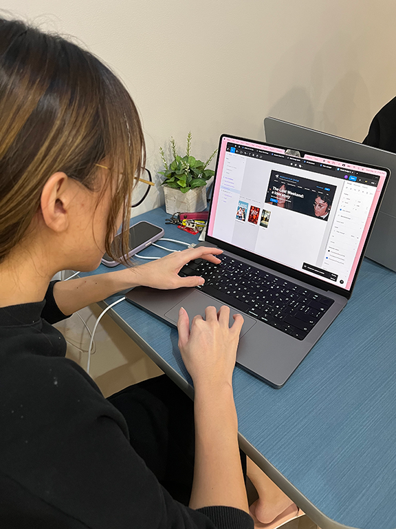
To assess the usability of our design system, we engaged 3 UX professionals to recreate any page from the existing website using our UI kits on Figma.
Impressively, they were able to accomplish this task within a few minutes, demonstrating the efficiency of our system.
In order to facilitate the seamless adoption of our Simula design system by designers, we have taken the initiative to publish the UI kits on the Figma community platform.
We documented the system's usage guidelines, including demonstrations of do's and don'ts, practical examples, and usage instructions, on the Zeroheight platform. This allows users to easily understand the system's meaning before incorporating it into their work.
Learning & Next Steps
Collaboration is vital in building a strong design system. As an accessibility designer, I brought attention to an issue with the seating key that others may have missed.
Moving forward, we aim to improve user guidance by implementing clearer labels, grouping, and other intuitive features for easy navigation and element utilization.
You may also like
-
![]()
Nearby Parking
A two-sided marketplace that connects people who want to rent out their idle parking spots with people who are looking for places to park.
-
![]()
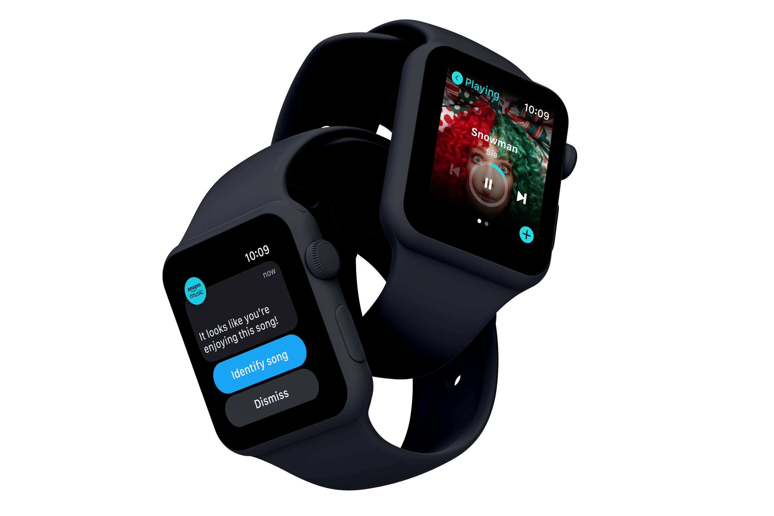
EmoBeat
A wearable solution that utilizes biometric data and emotion to address the problem of song recommendations not matching young adults' preferences
-
![]()
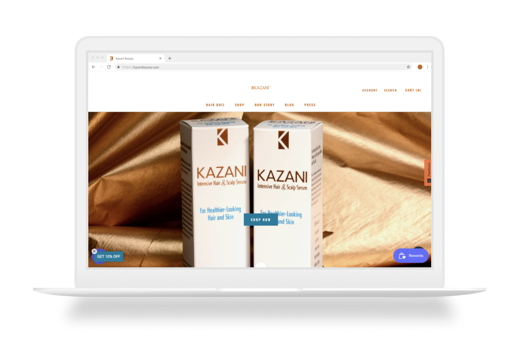
Kazani Beauty
Evaluate and improve the usability issues on a hair beauty website to make users stay on the website and purchase.
-
![]()
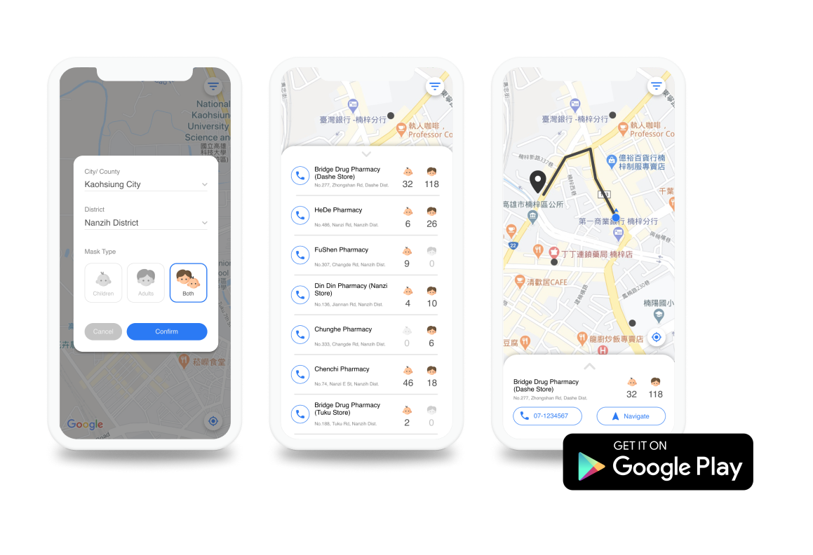
Instant Mask Map
A mobile app that empowers Taiwanese people to improve their efficiency in searching for masks.