Fostering Adoption Application Growth Through Enhanced Mobile Browsing Experience
Disclaimer: This project is with the real client, Rescue City (RC).
↓ View More
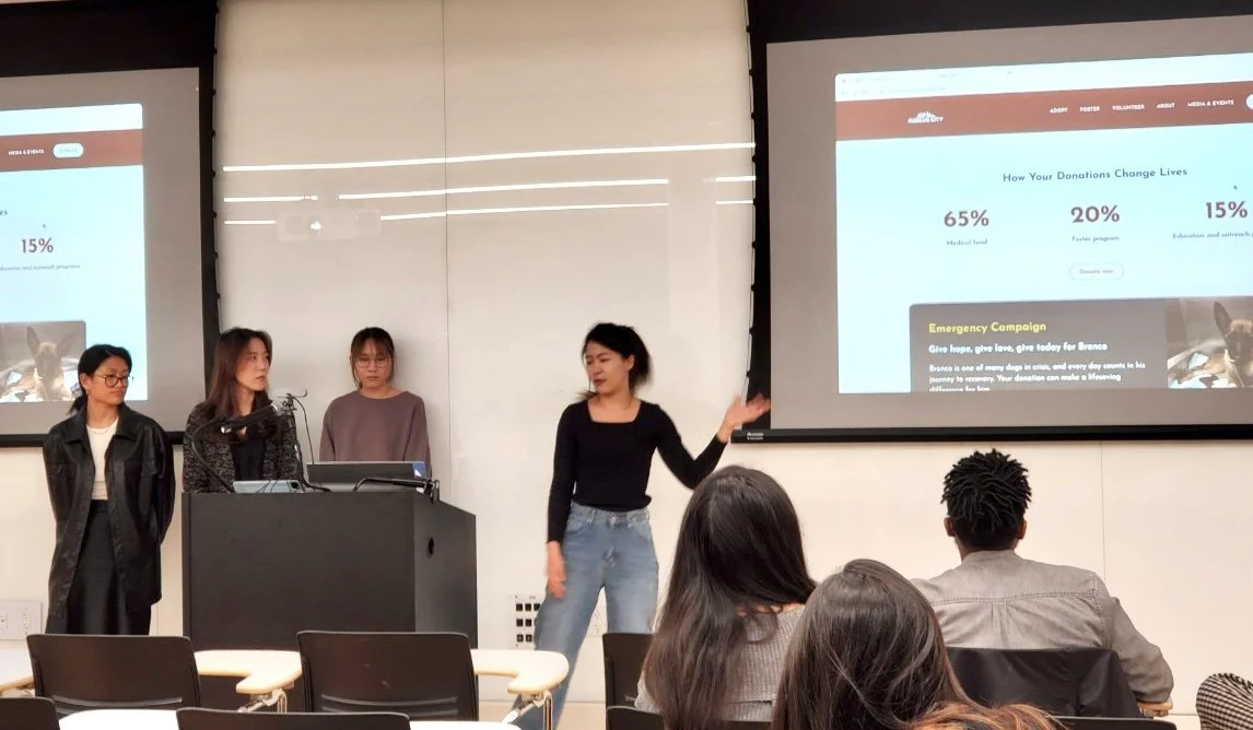
Our team led the enhancement of the Rescue City (RC) website's usability for potential adopters and community engagement. As the UX/UI designer, I collaborated with 3 consultants, conducted research, analyzed data, and created high-fidelity design prototypes. I presented our research findings to RC's VP at the project's end.
📄 Team Project for an External Client
📅 Feb - May 2023 (4 months)
🙋🏻♀️ UX/UI Designer
✨ Literature Review
✨ User Interviewing
✨ Ideation
✨ UI design
✨ Hi-fi prototyping
✨ Responsive Web Design
🔧 Figma
🔧 Google Suite
🔧 Optimal Workshop
What is the problem?
The non-mobile-friendly website hinders adoption applications for mobile-dependent users.
Rescue City (RC) is a New York City-based nonprofit dog foster organization boasting an impressive Instagram following of over 83K fans. Remarkably, 65% of users visit the RC website from mobile devices.
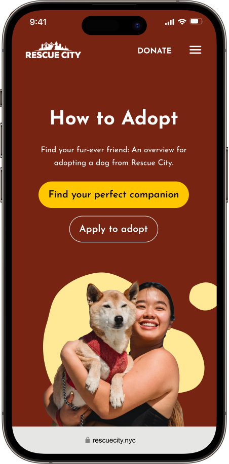
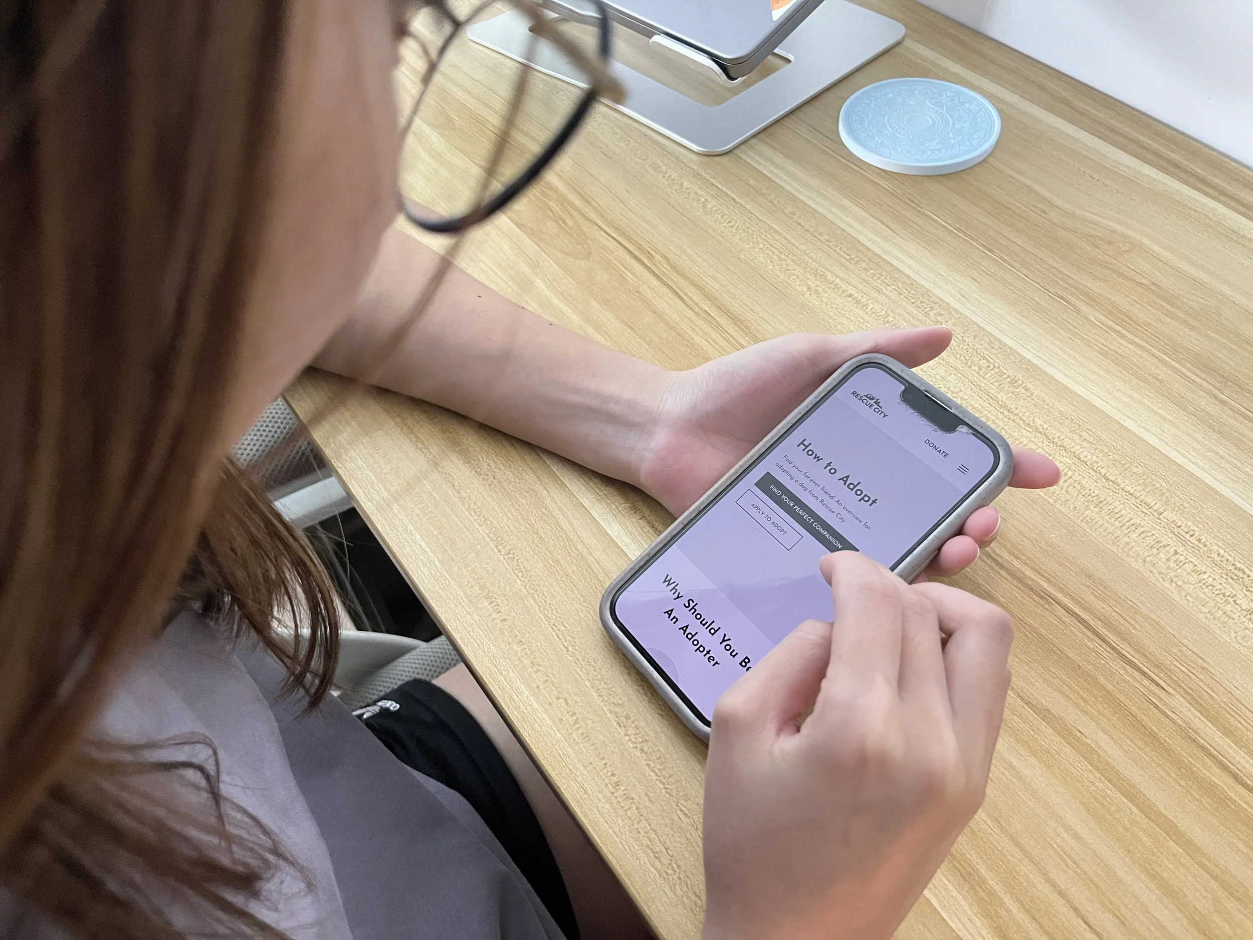
Unfortunately, the existing website was not mobile-friendly for the user group. Our primary goal was to transform the site into a mobile-friendly platform that actively encourages individuals to apply for dog adoption.
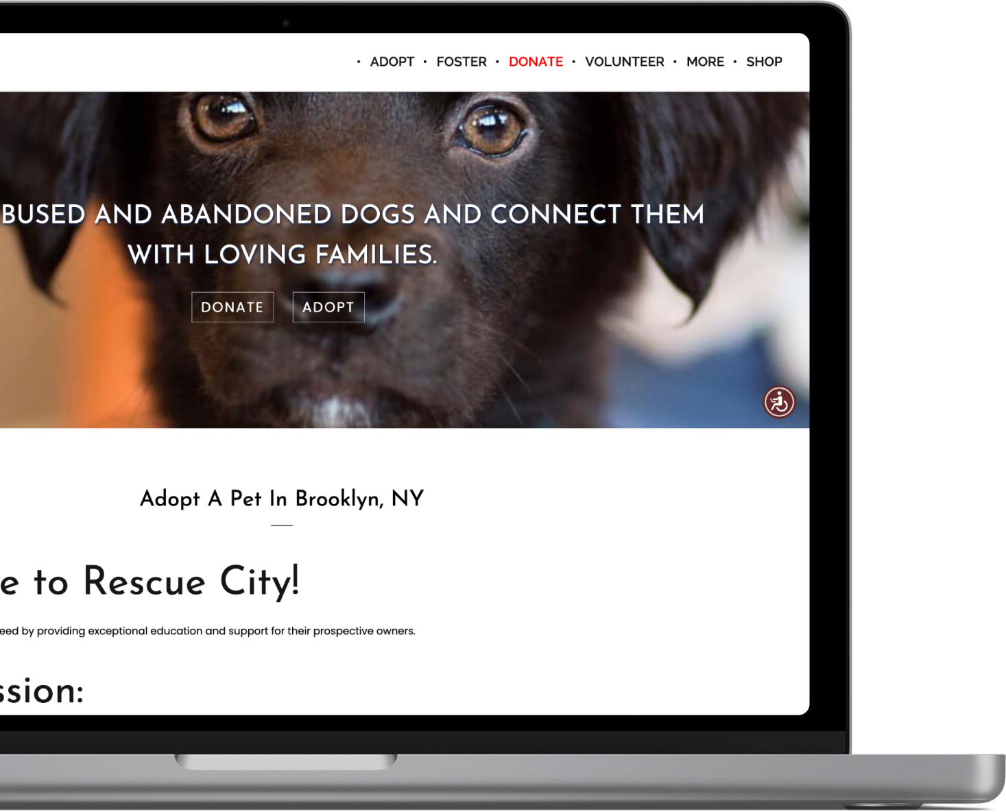
*Laptop Figure: Original RC’s website
Who are the adopters?
Interviewing individuals who are passionate about dogs and social impact.
RC's data showed that the majority of adopters in their 20s to 50s are active members of animal rescue communities, sharing a passion for dogs and a commitment to social impact.
We conducted interviews with 6 participants (ages 20-50) who had experience as donors, adopters, and volunteers to assess the adoption process flow through the RC site.
What do the adopters want?
Clear adoption information, connections with dogs, and trust
During the interview, we explored the context of their motivations for adopting dogs and their expectations prior to adoption. Eventually, 3 main problems were discovered:
⚠️ Difficulty understanding relevant adoption information before adopting.
“Am I eligible to adopt?”
“Text-heavy information lowers my willingness to adopt.”
⚠️ Challenges in connecting with and evaluating adoptable dogs.
“Can I be sure this dog is right for me?”
“Can I understand the dog's behavior and personality online?”
⚠️ Trust issues due to inconsistent UI and third-party plug-ins with different branding.
“Why does the website redirect me to another site?”
“Is my information truly submitted to RC?”
How can we solve the 3 problems?
Identifying 3 new solutions for each problem.
Wireframing
Sketching out wireframes for each solution to test out with users
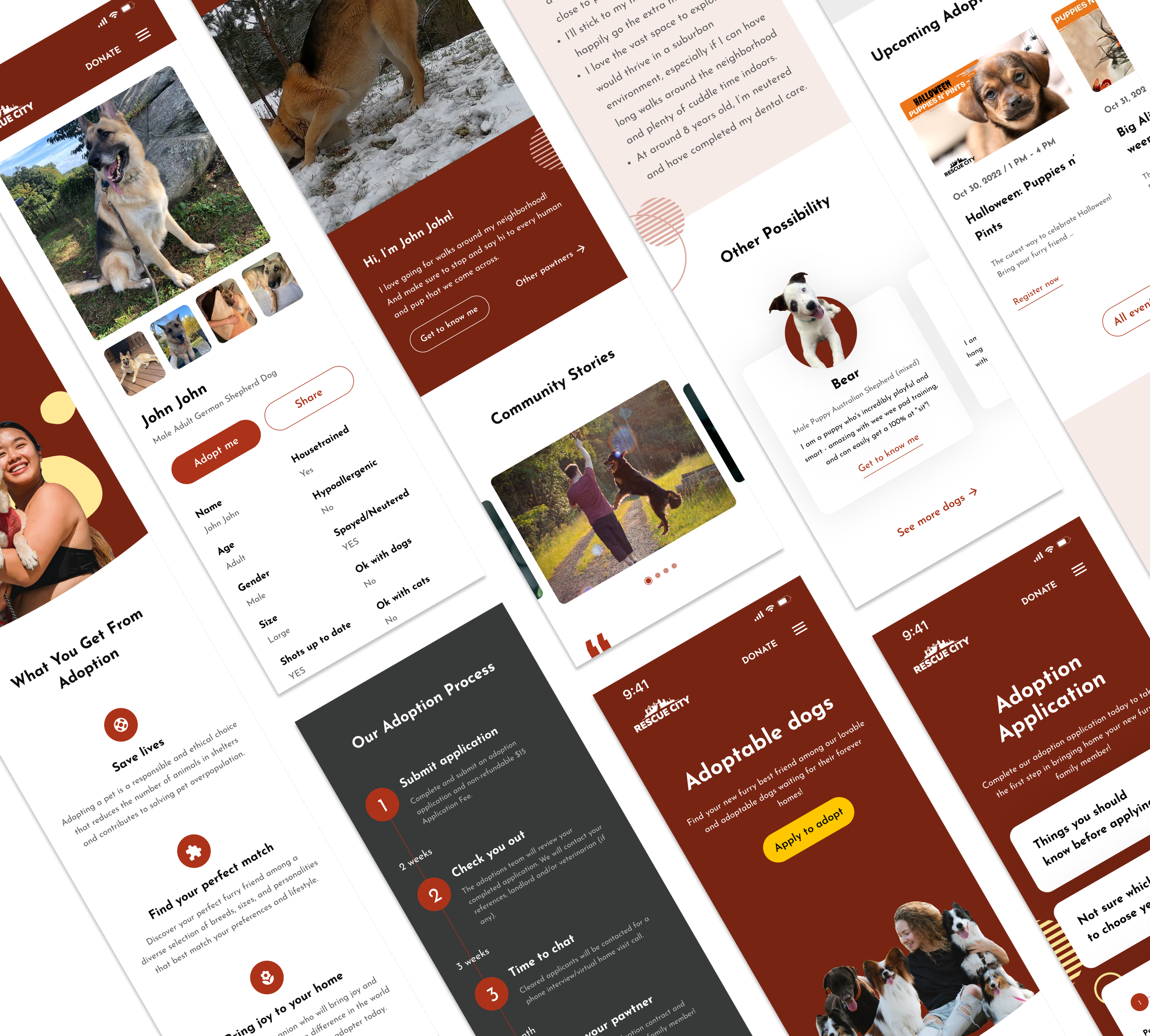
Feature 1: Utilize the diagram and adjust layouts for easier comprehension.
Enhance visual hierarchy for potential adopters' ease in finding and digesting information before adoption.
Feature 2: Facilitate interaction for understanding dog personalities.
Provide interaction videos to showcase each dog's personality and immerse potential adopters in a shared life experience with their future companion.
Feature 3: Ensure UI consistency throughout the entire site.
Consistent interfaces and removing third-party plugins.
Feature 2-1: Facilitate interaction for understanding dog personalities.
Increase opportunities for dogs and potential adopters to meet in-person, facilitating interactions before making commitments.
Test & Iteration
Revising the design based on user feedback
We invited 6 participants who had adoption experience (ages 20-50) to test our solution using mobile wireframes and gathered valuable feedback.
Based on the observation and feedback, we identified a few usability issues and some of the users' behavior was not as we expected. Then we made revisions to some of our designs.
AfterBeforeEnsuring Adopters Are Well-Informed
Before:
Participants jumped directly to the application page without knowing the necessary adoption requirements to read first.
After:
Emphasize “things you should know before applying” on the application page, guiding Instagram users directly to the “how to adopt” page for essential information.
BeforeAfterPriority on Video Showcase and First-Person Introduction Update
Before:
Participants loved dog videos for understanding personalities, but they were not easily discoverable.
Conventional dog introductions for adoptable dogs lacked authenticity and closeness, feeling like sales pitches.
After:
Prominent Video Display: Enlarge videos on the page to emphasize each dog's uniqueness, encouraging a shift towards companion-focused adoptions.
Engaging First-Person Intro: Create dating app-style intros for dogs, fostering emotional bonds and shifting from transactions to companionship.
Outcome
What does the adoption flow look like now?
I designed 60+ high-fidelity screens using Figma for a responsive website prototype.
Following WCAG 2.1, I created reusable components and UI kits to ensure uniform design and accessibility. My startup experience enabled me to lead the design of these screens.
What did the client say?
Positive reception sparked plans for website overhaul
“Our internal team loved these changes and how much of an improvement they make in terms of our applications and accessibility […] We are meeting with our web team next week to see how we can overhaul the website to make these changes!”
*Currently, the technical team at Rescue City is updating the site based on our research and design. Once the updates are live, I will be delighted to share the final changes!
What did I learn?
Prioritize Content when adapting smaller screens
When designing for mobile, pay attention to the most necessary content and features. Think about what users really need and use often. Reduce and hide non-essential elements to avoid clutter.
You may also like
-
![]()
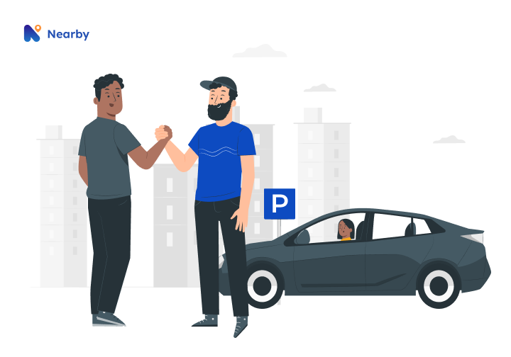
Nearby Parking
A two-sided marketplace that connects people who want to rent out their idle parking spots with people who are looking for places to park.
-
![]()
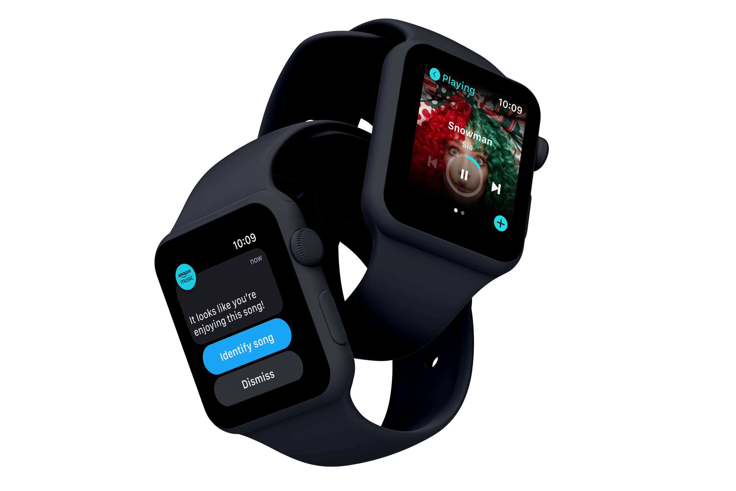
EmoBeat
A wearable solution that utilizes biometric data and emotion to address the problem of song recommendations not matching young adults' preferences
-
![]()
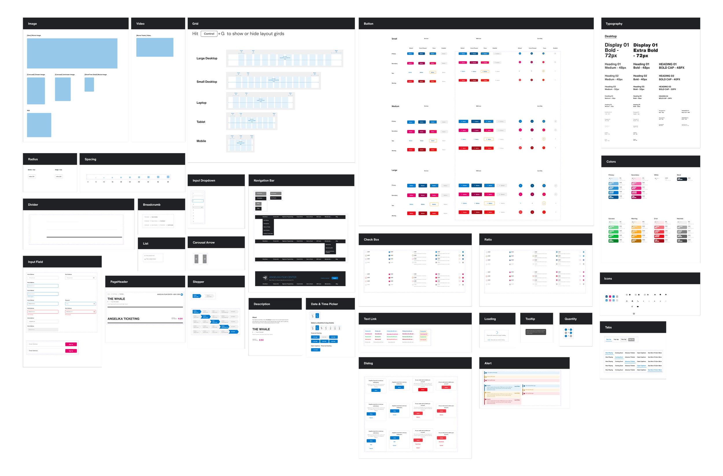
Simula Design System
Crafting an atomic design system to address design inconsistencies and enhance accessibility.
-
![]()
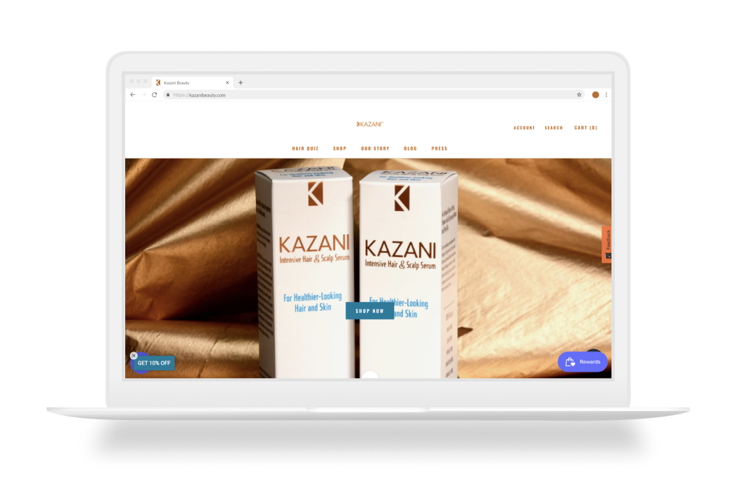
Kazani Beauty
Evaluate and improve the usability issues on a hair beauty website to make users stay on the website and purchase.
-
![]()
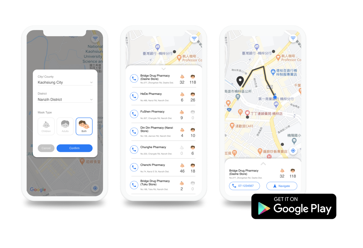
Instant Mask Map
A mobile app that empowers Taiwanese people to improve their efficiency in searching for masks.